JimmyTwoBucks Posted November 20, 2012 Report Share Posted November 20, 2012 Hi... long time Space Quest fan, this is my first time posting... I'm really looking forward to the new game, and I'm sure it'll be amazing. Though one thing makes me uneasy, though just in a small way and I wondered if anyone else felt the same... One of the reasons I really liked Space Quest, was that the characters and environments all were done in a sort of "realistic" style, like Roger looked like he could be a "real" person and the places he went looked like they were done seriously. I thought that made the game really involving and also made the humor even funnier, because it was contrasted with a "real" and "lived-in" sci-fi world that had all this cool stuff like space malls and space fast food, etc. While the new game, just from the style of the artwork, seems to have moved away from that a bit? Like Ace Hardway seems more "cartoony" in his look, like he has a really exaggerated neck and everything. I just hope the new world that's being created still has a sort of grimy, lived-in feel, rather than a more cartoony one... I know Space Quest 6 had a slightly more cartoony feel than the previous ones, though I felt it still had enough solid environments that made it feel like a real place... Quote Link to comment Share on other sites More sharing options...
Troels Pleimert Posted November 20, 2012 Report Share Posted November 20, 2012 Hey, Jimmy. Thanks for stopping by. There's Keronian ale in the fridge; help yourself. One of the reasons I really liked Space Quest, was that the characters and environments all were done in a sort of "realistic" style, like Roger looked like he could be a "real" person and the places he went looked like they were done seriously. While the new game, just from the style of the artwork, seems to have moved away from that a bit? Like Ace Hardway seems more "cartoony" in his look, like he has a really exaggerated neck and everything. I just hope the new world that's being created still has a sort of grimy, lived-in feel, rather than a more cartoony one... I'm with you on the grime thing. From the blood-stained corridors of the Arcada in SQ1 to the dingy feel of XOS4 in SQ2; from the jumbled shithole that was the garbage freighter in SQ3 to the war-torn shithole that was the streets of Xenon in SQ4/SQ12, from the puke-infested Goliath in SQ5 to the gungy, smog-infested streets of Polysorbate LX in SQ6. I loved all that, and I'm completely with you on that. I wouldn't go so far as to call it realistic, though. When we talked with Mark Crowe in the fan Hangout from the Tennessee convention, we learned that the earlier games in the series didn't really have a "style," so to speak. It was more a question of creating graphics using very limited means that looked impressive. There wasn't any conscious realistic nor cartoonish style in play. With the advent of VGA graphics and higher color palette, SQ4 took the first turn towards "comic book" style graphics, but coupled with rotoscoped character animations and, again, a healthy dose of grime. SQ5 is, I think we can all agree, the most "cartoonish" of the series, and even that game was crawling with gunk. With SQ6 and Super-VGA, the character animations were admittedly at times very cartoonish, but the background art wasn't exactly Tex Avery, if you know what I mean -- and SQ6, as we know, was the only Space Quest in which Mark Crowe didn't have any input on the graphic style. What I'm saying is, I completely get what you say about the "dirtiness" of the Space Quest series, but I don't agree that that somehow made it "realistic." With Ace Hardway and the new SpaceVenture, I get the feeling the artwork is a direct continuation of the "graphic novel/comic book/computer graphics" hybrid of art style that SQ4 (the game I feel has the strongest visual style of the original series) wanted to be. The art style that we've seen at www.svrewards.com seems to be inspired by many diverse art styles; again, comic books being one of them but not necessarily the main influence. There are plenty of other games that take the "cartoonish" style to artful heights, like Day of the Tentacle, or some of the old Coktel Vision games like Goblins 3 and Woodruff and the Schnibble of Azimuth. Also, Ace works in waste disposal and cleans people's gunk out of pipes. That's hardly Tom & Jerry material. ;) For my money, the art for SpaceVenture that we've seen thus far looks awesome. But hey, if you've seen my Facebook profile pic, you'll know I'm a bit biased on this. ;) Quote Link to comment Share on other sites More sharing options...
JimmyTwoBucks Posted November 20, 2012 Author Report Share Posted November 20, 2012 Thanks for your reply! Great to be able to talk to other Space Quest fans... I know what you mean as far it not being like 100% realistic... probably the wrong wording from me there, because yeah, it's always like a comic book style in some way... What I mean more accurately then is that previous ones had fewer exaggerated features... For example in something like Space Quest 4, in the main gameplay and in the cut scene parts, his body is always in proportion... he never has like a giant head compared to a small body, or like an impossibly large cartoon jaw or anything like that. While I think Ace Hardway has more of those kind of exaggerated cartoon features... Not that that's a bad thing, but I was surprised that it seemed be drawn in that direction. It reminds me a bit of Monkey Island, where in the later installments he became more cartoony, while in close-ups in the first couple of games and on the box art, etc. he was drawn as if he was more of a "real" person. I guess I mean the difference between this -- ...where that could be pretty much a scene from a movie, but just drawn as an illustration, and this -- ...where he seems less like a "normal" proportioned person... Or during the game, this -- ...where again, he looks pretty much like "normal" person, compared to -- ...where he looks more like a cartoon to me... Again, I don't think it's like a totally bad thing... I guess I'll have to wait until I see Ace in other environments and everything until I can get a real feel for what the overall style is like... seeing him in a few grimy bars will probably make me more at ease with the style! Dat Engineer 1 Quote Link to comment Share on other sites More sharing options...
Collector Posted November 21, 2012 Report Share Posted November 21, 2012 I, too am a bit put off by all of the cartoony art work in newer adventure games. It is far too over used. For some games it may in keeping, both in terms of the nature of the game and in keeping with its past. By the time you get to VGA, the LSL games became more stylized caricatures. Sometimes, though, the absurdity of some situations is more acute and therefore funnier when it is more relatable to real life. Cartoons can make it too abstract. That said, SpaceVenture is not Space Quest. It might borrow heavily Scott and Mark's humor and puzzle style that they used in Space Quest, but it is its own entity. Whether it fits or not remains to be seen, but whatever the case, we should be happy for a new game from them. I am sure that they will deliver a quality product. pcj 1 Quote Link to comment Share on other sites More sharing options...
Capn_Ascii Posted November 21, 2012 Report Share Posted November 21, 2012 Not long ago, I went on a bit of a diatribe about this subject in a thread about the new Leisure Suit Larry remake. Read that post for the details, but the gist of it is that, the way I see it a game's art style should reflect the game's own style. Leisure Suit Larry games *never* take themselves seriously. From the lovable-loser protagonist who spends each game being a sleazy-yet-oddly-endearing dork to the viciously "you suck" narrator to the ridiculously over-the-top situations, these games were made first and foremost to make the player laugh. Somewhere along the line, Al realized this and changed the art style from 'neutral' (as discussed above, the early Sierra games were defined by an art style that was basically the *lack* of an art style) to the current cartoonishly-exaggerated look. In this case, the goal was to make the games feel 'fun' and lively even when nothing explicitly funny was happening on-screen at the time. The Space Quest games, while also funny, exhibit more of a sarcastic, subdued sense of humor. In SQ, the *in-character* universe is 100% serious - Roger is a normal guy facing deadly situations, and there's not a hint of 'this is funny' to any of it. The humor in SQ comes from its 'out-of-character' aspects - in particular, the snarky narrator and the many references/gags/in-jokes that are transparent to Roger and only funny to us, the players. Because of this, the relatively realistic style of graphics fits the series rather well, at least in my humble1 opinion. Even the later games, while taking on some cartoonish aspects, kept the characters realistically-proportioned and such. Personally, I like the graphical style of Spaceventure - it's more cartoonish than the later SQ games, yet still has some grounding in reality (which makes the sci-fi elements more visually impressive). Any further judgement on my part will have to wait until the game is released and I can see what kind of humor the writers are going for this time - then I'll be able to say whether this particular graphical style suits the game's atmosphere. It is far too over used. In my experience, it's *only* used when the game is a 'funny' or highly stylized one that warrants it. Frankly, I can't recall an adventure game in recent memory where the art style struck me as contrived or out-of-place - they always felt like a natural part of the game. If a game warrants a cartoony art style, I say let the game have it - nothing wrong with that at all. Unless you *personally* don't like highly stylized art. In which case, that's your problem to get over. ;) 1) BOW BEFORE MY INFINITE WISDOM!!! penguinfan 1 Quote Link to comment Share on other sites More sharing options...
JimmyTwoBucks Posted November 21, 2012 Author Report Share Posted November 21, 2012 Leisure Suit Larry games *never* take themselves seriously. From the lovable-loser protagonist who spends each game being a sleazy-yet-oddly-endearing dork to the viciously "you suck" narrator to the ridiculously over-the-top situations, these games were made first and foremost to make the player laugh. Somewhere along the line, Al realized this and changed the art style from 'neutral' (as discussed above, the early Sierra games were defined by an art style that was basically the *lack* of an art style) to the current cartoonishly-exaggerated look. In this case, the goal was to make the games feel 'fun' and lively even when nothing explicitly funny was happening on-screen at the time. I definitely agree with you in regards to how you described Space Quest, that's how I felt about it, like I was watching/playing in a real-life universe that happened to have crazy stuff going on in it, and narration "outside" of what was happening. And although I understand the points you make with Leisure Suit Larry, I have to admit that when I was playing LSL1, I always felt the cool thing about it was that it was like a "real" world, where you could go to a bar, a hotel, a store, and you were this actual person. I never thought I was playing as a cartoon character... and I think the series lost a lot of appeal to me when it became cartoonier... Having said that, I think it was a LOT easier to come across as more "real" with those early graphics (funnily enough), because you could project onto them what you wanted them to be, while as graphics got "better" you had to have more detail and it made the creators have to choose one way or the other, and if you liked the realistic take, then it was tough-luck in some cases... But even if the creators say they weren't going for any style in particular, I think it was clear they weren't going for an exaggerated cartoony style... Like if you look at the close-ups, no one has like a massive chin or nose or anything... eg. this is meant to look like a "real" woman -- we should be happy for a new game from them. I am sure that they will deliver a quality product. Yeah, I'm very excited about the new game, I think the overall look, from what I've seen so far, is my only slight concern. Quote Link to comment Share on other sites More sharing options...
Capn_Ascii Posted December 11, 2012 Report Share Posted December 11, 2012 And although I understand the points you make with Leisure Suit Larry, I have to admit that when I was playing LSL1, I always felt the cool thing about it was that it was like a "real" world, where you could go to a bar, a hotel, a store, and you were this actual person. I never thought I was playing as a cartoon character... and I think the series lost a lot of appeal to me when it became cartoonier... Well, a big part of that is probably the Police Quest series. Like LSL, PQ took place in the real world instead of a fantasy/sci-fi realm. Unlike LSL, PQ was never about laughs, so the art style stayed 'Sierra-neutral' through all three of the original series (and then went to FMV for Open Season). If Larry had stayed with that same look, it not only wouldn't have been nearly as funny or outrageous, but it would have started to mush together with PQ theme-wise. eg. this is meant to look like a "real" woman Well, I also mentioned that in the Larry thread. Despite all of the exaggerated art style in the newer Larry games, the one part of the graphics that *never* gets stylized is the girls themselves. Larry games are all about the sexy wimmins, and it's hard to make a human look traditionally attractive *and* stylistically exaggerated at the same time. The most the ladies get is some fudging of body proportion to Jessica Rabbit-esque levels, and that was only really in LSL7. As a side note, I'll mention that one of the things I really liked about Magna Cum Laude is that each and every one of the girls has their own body proportion as part of their character designs. Some of the girls are overly (and deliberately) curvy/busty/etc., while others have more realistic proportions, petite builds, scrawny nerd physiques, different heights, and such. It was a nice touch to see a Larry game where they made it a point to add realistic physical diversity to the female cast, instead of focusing mostly on the hair/head/face for differentiation (as was done in the main Larry games). ......... .....uh, what were we talking about? :blink: Quote Link to comment Share on other sites More sharing options...
Collector Posted December 11, 2012 Report Share Posted December 11, 2012 If Larry had stayed with that same look, it not only wouldn't have been nearly as funny or outrageous So SNL, Monty Python or any number of non animated comedy shows or movies are not that funny? Simply adding an exaggerated cartoon art style does not automatically make something more funny. If it fits the style of the theme then fine, but many things are far funnier when they are more relatable than what is possible with cartoon graphics. Quote Link to comment Share on other sites More sharing options...
Capn_Ascii Posted December 12, 2012 Report Share Posted December 12, 2012 Simply adding an exaggerated cartoon art style does not automatically make something more funny. That's true, but it's not about making it more funny - it's about how, in Larry's case, *not* having its trademark art style makes it *less* funny. LSL is *meant* to look the way it does. The art style is perfect for the game's tone and sense of humor - it's like finding the perfect 'look' by mix-and-matching articles of clothing until you find an outfit that suits you just right. The cartoonish exaggeration of the later games is exactly what the series *should* look like - not because the style is inherently funnier than other styles, but because the style suits Larry so perfectly that using anything *else* is a waste of potential. Imagine, if you will, a dapper gentleman who attends a party wearing ragged hobo clothes, or a beautiful woman who only dresses in drab, frumpy outfits. The presentation of something is as important as the substance itself - choosing the wrong way to showcase it can work against the intended effect, or even derail it entirely. Regardless of your personal taste, certain styles say certain things - realistic styles tend to say "drama and seriousness", while more exaggerated styles tend to say "funny, levetic, and whimsical". There's a reason that The Walking Dead is shot as a live-action series, while Family Guy is cartoony and stylized - doing it the other way around simply doesn't work. Various styles have certain expectations in the minds of the audience - as a writer/designer/artist, you *must* play by those rules if you want your work to achieve the desired effect. You can decide not to if you really want, but the resulting work simply won't be as good as it *could* have been - and as a fan of all forms of creative media, that always makes me sad. :( One last comment on the Larry series in particular - the original manual for the first Leisure Suit Larry game, way back in the late 80s, had a couple of sketches of Larry meant to demonstrate his dorky character (and lack of fashion sense). Those sketches are done in the *same art style* as the later Larry games - Larry has the same short stature, the same cartoonishly big head and nose, misproportioned limbs, etc. In other words, Larry *already* looked like that in Al Lowe's head even *before* he made the concious choice to apply that art style to the games - the only reason the early games had a 'realistic' style at all is because the lack of available colors and pixel resolution made any sort of stylization next to impossible. As for Saturday Night Live and Monty Python...they, too, have styles that suit them, which is what makes them good. Monty Python is absurdist humor, which benefits from the live-action portrayal - the bizzare, nonsensical things they do for laughs are funnier *because* everything otherwise looks totally normal and realistic. SNL, meanwhile, is mostly classic sitcom-style sketch comedy, which works best with a subdued, realistic style as opposed to a more exaggerated look (which would draw attention away from the dialogue, where most of the humor comes from). Now, if you'll excuse me, I'm going to scroll up a couple of posts and look at that screenshot again. :ph34r: JimmyTwoBucks and Dat Engineer 2 Quote Link to comment Share on other sites More sharing options...
JimmyTwoBucks Posted December 12, 2012 Author Report Share Posted December 12, 2012 Having thought about the SpaceVenture graphic style some more, I think I'm getting more comfortable with it... I think I was just basing it off what I saw in the short demo thing they did, in the dome... But if I start to imagine Ace in a fully finished world where he can go to different planets and a bar and run into different aliens, etc., it starts making more "sense" in my head, how it will work with the the graphic style they've gone for... Eg. aliens will get to have the same exaggerated-photo look as Ace's head, and I think that will really work and be interesting... I think it would be hard pulling off the SQIV "feel" and look with more detailed graphics, the level of graphics then were probably perfect for making it look sort of "real", but being just "blurry" enough that they didn't have to show you too much, like detailed faces, etc. Quote Link to comment Share on other sites More sharing options...
Blackthorne Posted December 15, 2012 Report Share Posted December 15, 2012 I'm not looking for Space Quest in SpaceVenture. I'm looking for SpaceVenture to be it's own thing. Style wise, it has to be different. Besides, Roger - 100% serious? Come on. We're introduced to the dude via his nap in a closet during an alien raid on his ship! Heh. Bt Quote Link to comment Share on other sites More sharing options...
Troels Pleimert Posted December 16, 2012 Report Share Posted December 16, 2012 If I may take a step back for a moment, I think we can all sleep safe knowing that SpaceVenture won't be a cartoon adventure, at least not in the Tex Avery sense. It may borrow elements from that style, just as it borrows elements from graphic novels and the Alien movies. I think the predominant influence we've seen from the concept art thus far has been the modern style of computer animation like Pixar and such, but with a grungier tone. I, for one, have no problem with that. Hell, I loved Wall-E. ;) JimmyTwoBucks and nockgeneer 2 Quote Link to comment Share on other sites More sharing options...
Capn_Ascii Posted December 17, 2012 Report Share Posted December 17, 2012 Those sketches are done in the *same art style* as the later Larry games - Larry has the same short stature, the same cartoonishly big head and nose, misproportioned limbs, etc. In other words, Larry *already* looked like that in Al Lowe's head even *before* he made the concious choice to apply that art style to the games. I don't normally quote my own posts (I'm not *that* narcissistic), but something I forgot to mention - in addition to the sketches, the original box arts for LSL 1-3 *also* had Larry drawn in that same exaggerated manner. The art style more or less existed from Larry's inception - the games simply couldn't convey it properly until resolutions and color depths increased sufficiently. Hell, I loved Wall-E. Hear, hear. :lol: Although I try not to watch it too often...it has an odd habit of making my eyes tear up. Some kind of allergic reaction, I guess. :ph34r: Troels Pleimert 1 Quote Link to comment Share on other sites More sharing options...
Frede Posted December 17, 2012 Report Share Posted December 17, 2012 I happen to be allergic to the end credits, so you're not alone. I'm way more allergic to the first 15 minutes of "Up", though... Quote Link to comment Share on other sites More sharing options...
nockgeneer Posted December 17, 2012 Report Share Posted December 17, 2012 I'm way more allergic to the first 15 minutes of "Up", though... Oh man, talk about manly tears. They go, "Here, have a nice story about childhood friends that grow up and get married. Sweet story, right? They're such a cute couple. Now here's a knife to stab yourself in the heart with. Are you done yet? Make sure you get it reallly deep and twist a couple of times. Great. Now we can start with the rest of the movie." Frede 1 Quote Link to comment Share on other sites More sharing options...
Frede Posted December 17, 2012 Report Share Posted December 17, 2012 Indeed. Goes to show that animation can be right up there with other art forms. Quote Link to comment Share on other sites More sharing options...
Troels Pleimert Posted January 3, 2013 Report Share Posted January 3, 2013 Indeed. Goes to show that animation can be right up there with other art forms. I thought animation was an art form? ;) Hell, anything I'm terrible at is automatically an art form in my book. Yes, this means "math" is also an art form. When applied correctly. Having thought about the SpaceVenture graphic style some more, I think I'm getting more comfortable with it... And hey, Jimmy, I'm glad we could twist your arm and threaten your family enough to make you see things our way. ;) JimmyTwoBucks 1 Quote Link to comment Share on other sites More sharing options...
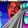
JimmyTwoBucks Posted February 18, 2013 Author Report Share Posted February 18, 2013 And hey, Jimmy, I'm glad we could twist your arm and threaten your family enough to make you see things our way. ;) Haha, having seen the couple of screenshots from the facebook page, I am COMPLETELY sold now on the look... I assumed the look would be slightly different to the test version with the dome, but the difference really is night and day, I think they've totally nailed it! Can't wait to see other characters, locations, etc. Decaffeinated Jedi 1 Quote Link to comment Share on other sites More sharing options...
MusicallyInspired Posted February 19, 2013 Report Share Posted February 19, 2013 Simply gorgeous. The first shot reminds me of the Eureka from SQ5 and the second is totally the pipe tube from SQ3 in the garbage freighter. Decaffeinated Jedi and Frede 2 Quote Link to comment Share on other sites More sharing options...
pcj Posted February 19, 2013 Report Share Posted February 19, 2013 Hehe... ;) Quote Link to comment Share on other sites More sharing options...
MusicallyInspired Posted February 19, 2013 Report Share Posted February 19, 2013 (even though both look like the same corridor from different angles, yes) Quote Link to comment Share on other sites More sharing options...
JimmyTwoBucks Posted February 20, 2013 Author Report Share Posted February 20, 2013 I can't wait to stroll along one of those corridors clicking on things... nockgeneer 1 Quote Link to comment Share on other sites More sharing options...
jfrisby Posted March 8, 2013 Report Share Posted March 8, 2013 I'm loving how things are looking, though it has taken awhile to adjust to the new high-res thing... I guess the thing I'd like to see is some nice darker areas :) -- I guess that's what we haven't necessarily seen in the new style. I definitely think it's looking nicer (to me) than other more cartooney-styled games, like Deponia, or Curse of Monkey Island. Quote Link to comment Share on other sites More sharing options...
nockgeneer Posted March 8, 2013 Report Share Posted March 8, 2013 I definitely think it's looking nicer (to me) than other more cartooney-styled games, like Deponia, or Curse of Monkey Island. It does look nicer for sure, but I think Deponia's very cartoony fits it much better than a more *realistic* look like this would. Why? Because of the ridiculous things Rufus somehow manages to survive... and the ridiculous things in general there are in that game. I'd rather something *fits* than just looks good. I wonder how a game with every scene a Rembrandt in high-res would turn out... That said, I think this will turn out exactly as the Two Guys envision it... perfect. And eminently playable. Quote Link to comment Share on other sites More sharing options...
Dreams Posted March 8, 2013 Report Share Posted March 8, 2013 I can't wait to stroll along one of those corridors clicking on things... That's probably the thing I have with the screenshots of the new game. I love the SQ games, and I still play them regularly. I kinda like the graphics in the SpaceVenture screenshots , but the scenes look really empty. There is nothing to click on, no real world objects. I really hope those scenes get a lot of dressing during the development of the game.. Quote Link to comment Share on other sites More sharing options...

Recommended Posts
Join the conversation
You can post now and register later. If you have an account, sign in now to post with your account.