MusicallyInspired Posted December 29, 2011 Report Share Posted December 29, 2011 That's fantastic. Quote Link to comment Share on other sites More sharing options...
Frede Posted December 29, 2011 Report Share Posted December 29, 2011 Good to hear this is moving forward :) Quote Link to comment Share on other sites More sharing options...
Datadog Posted December 29, 2011 Report Share Posted December 29, 2011 Just got your message. You still look like you're making lots of progress. I particularly enjoy reading about your 3D referencing. I've only done that with characters, so it'll be neat seeing it done with architecture. Quote Link to comment Share on other sites More sharing options...
pcj Posted December 29, 2011 Report Share Posted December 29, 2011 Good news, but I think after 4 years I would have just re-done everything. Fortunately VSB never ran into a data loss problem, although through distributed project management our data redundancy made for a fairly robust backup scheme. I hope you learned the importance of data backup. Good luck on finishing the project. Quote Link to comment Share on other sites More sharing options...
Johnathon Posted January 6, 2012 Author Report Share Posted January 6, 2012 Gentlemen, thank you, and, more specifically, jcp, you would only have redone everything after those four years because you are not privy to the richness of creative writing that comprises OEOE's screenplay. :wink: I prefer to think of what's necessary as... polishing/editing - and having retrieved many of these files will certainly help me in my becoming more organized and finalized with this. I certainly have learned my lesson, too. Though, only a very small fraction of the screenplay itself was ever really lost. I was very good with backing up the most important stuff. It was just the many supplemental development files (image references, team chats, and various miscellaneous ideas) that had been lost - and for the ideas, only those completed in the last month before the "crash." Those, and the few images, of course. No matter, great progress is being made. I really look forward to getting this thing back into the momentum it had been. I'll admit, team collaboration could be much better, but one of the mistakes I'd made before was not having enough prepared for my team to work on. The ratio of 'leadership/direction' from me to my team is practically 99/1. Now that the art dev will speed up incredibly from this point out, this will open up much more for the others to work on and contribute with - "room descriptions, programming, and other such details..." I'm pretty much the only artist working on this thing, and that, as you know without my explaining, is really what tends to be the hold up. Quote Link to comment Share on other sites More sharing options...
Datadog Posted January 6, 2012 Report Share Posted January 6, 2012 I'm pretty much the only artist working on this thing, and that, as you know without my explaining, is really what tends to be the hold up. Brother, I feel your pain. Quote Link to comment Share on other sites More sharing options...
Sslaxx Posted January 7, 2012 Report Share Posted January 7, 2012 Wanting to work on games, but needing artists due to 0% artistic ability, is even more painful... Quote Link to comment Share on other sites More sharing options...
Troels Pleimert Posted March 11, 2012 Report Share Posted March 11, 2012 This game looks great! Can't wait to see more of it. You should have a progress bar on the front page of your website. :) Quote Link to comment Share on other sites More sharing options...
Johnathon Posted March 11, 2012 Author Report Share Posted March 11, 2012 Chris, Sslaxx, yes, I observe such is the most common hurdle for any fan-game producer or production team. Mr. Pleimert (SQ Historian Extraordinare), I am glad to read such enthusiasm coming from one such as yourself regarding the fan-game. A status bar did cross my mind a week ago as I was making a quick website appearance update. My biggest goal, however, is to wrap up the demo for day 1. I'm afraid it won't be ready for release by the next update, but I aim to have it prepared for this coming August. (I actually mentioned on the website having desired to have it completed quite well before this, but I got sidetracked when I entered university and also as I was experimenting with more complicated/fancy methods of art production and animation for the whole game overall :P ) Though, as I say now, the demo really is the next top priority now, and it is quite long enough to give the player a good sense of the overall game (it's also literally a chunk of the game itself, not like the sq6demo was to sq6) - so if you can't wait to see more of the game, I'm am confident the demo will serve as a refreshing gratification after the long wait :) Thanks again, Johnathon Quote Link to comment Share on other sites More sharing options...
Troels Pleimert Posted March 12, 2012 Report Share Posted March 12, 2012 Wow, I get a "Mr." and everything. :) Thanks, man. Seriously, the hi-res EGA graphics look really sharp; kind of reminds me of the Legend games of yore. So does the interface in that first screenshot, with the SQ6 verb bar and the parser underneath. In fact, unless I'm reading everything completely wrong (and wouldn't that be a stretch), I think you've just solved the otherwise insurmountable gulf between parser-devotees and the icon-hip. Not to mention the amount of fun you can have at the expense of the player with that approach. ;) I'll look forward to the demo. And I've got this thread bookmarked, so I'm keeping up with the updates as well. Quote Link to comment Share on other sites More sharing options...
Johnathon Posted March 12, 2012 Author Report Share Posted March 12, 2012 Indeed, but I shall resist the temptation to torture the player beyond fair game (pun pun) :oops: More interestingly, I have also devised a revolutionary manner of utilizing the elements of the game beyond the interface (I could say which ones, but I won't squeal them just yet) to greatly improve interaction, experience, and replayability which as I am aware has not been tried in any other adventure game (this idea was inspired by an element of Gold Rush which appeared in the game very briefly, and perhaps not executed to it's fullest or obvious potential, and so I doubt many would think to expand upon it.) Once the demo comes out, it will all make sense to you. I'm certain right now all I'm doing is confusing and taunting by arousing curiosity. Quote Link to comment Share on other sites More sharing options...
Troels Pleimert Posted March 12, 2012 Report Share Posted March 12, 2012 Taunting, yes, but you have my full attention. The parser really is a long-lost artform; it just needed its more frustrating elements minimized. I've always thought a marriage between parser andicon interface would be the ultimate adventure game interface, cobining the ease of storytelling with the immersion of the written word. Legend almost got there with Eric the Unready, then threw it away with Companions of Xanth. Infocom's Hitchhiker still stands in my mind as the pinnacle of what you could do with the parser medium, even though it was still unfair as hell. ;) That turned into a rant, I'm sorry. Typing on a mobile keyboard is so slow, my mind has way too much time to wander. Quote Link to comment Share on other sites More sharing options...
Spikey Posted April 26, 2012 Report Share Posted April 26, 2012 Quick well-wishes and hope this is still being worked on. ;) Quote Link to comment Share on other sites More sharing options...
Johnathon Posted April 26, 2012 Author Report Share Posted April 26, 2012 Thanks, Ali! And, yes, of course. In fact the team and I have been chatting a bit in the past week, planning our collaborations for this summer (starting in the next couple weeks!) We're prioritizing on the playable demo for Day 1 (approx 5% of the adventure's length), so look for it the end of this Summer (that's not a guaranteed deadline, but we aim to make it very close to that) Quote Link to comment Share on other sites More sharing options...
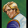
pcj Posted April 26, 2012 Report Share Posted April 26, 2012 The demo sounds nice - can't wait! I keep looking at your close-up shots of Roger and seeing Han Solo. Did you use Harrison Ford as a reference or something? ;) Quote Link to comment Share on other sites More sharing options...
MusicallyInspired Posted April 27, 2012 Report Share Posted April 27, 2012 Heh now that you mention it, he does have Harrison's nose. Quote Link to comment Share on other sites More sharing options...
Johnathon Posted April 27, 2012 Author Report Share Posted April 27, 2012 Haha, you guys... I used myself as a reference. I've got those genetically high cheek bones as a trait from my mother, so I figured I could pull it off. Of course I had to do a lot of manipulation to make it look mostly like Roger. Though, when I was younger, (and grew my hair longer), my mother always told me I looked like young Harrison from "Force 10 of Navarone," now... I just look like any other buzz-cut. I have been meaning to adapt those shots eventually, to make Roger look older. I think he could use some forehead creases, and maybe more prounounced brows? And if my spelling is off, it's cauase I pulled an all nighter (final architecture critique day at the college. I'm stressed over my grade, in severe pain in my head, and have alreayd begun medicating with some alchohol. Lol. Quote Link to comment Share on other sites More sharing options...
drdrslashvohaul Posted April 28, 2012 Report Share Posted April 28, 2012 Alcholol? Quote Link to comment Share on other sites More sharing options...
Johnathon Posted April 28, 2012 Author Report Share Posted April 28, 2012 Haha, that wasn't very professional of me last night, was it? I tell you though, I was in a great deal of pain. They ask way too much labor of their students in my program (soon to be ex-program), especially during the end of the semester. Quote Link to comment Share on other sites More sharing options...
drdrslashvohaul Posted April 28, 2012 Report Share Posted April 28, 2012 I'm a history PhD student. I haven't had to work hard in coming up to three years. ;) Quote Link to comment Share on other sites More sharing options...
Johnathon Posted May 3, 2012 Author Report Share Posted May 3, 2012 I myself am beginning a new major this coming august, computer science. I loved architecture as a subject, but the career requires one to be a workaholic, and I don't intend to become one. It also isn't very secure. NEW UPDATE: May 3rd, 2012 Space Questers! How have things been in your quadrant? I doubt given the incredible events of late that you've been capable of being caught sleeping in a broomcloset somewhere (if you have been, you've missed out on a lot). You don't need me to tell you about the Two Guys' reunion, the return of Frans Van Hofwegan to his administrator panel, the merging of SQ.net with the VB, nor the release of three awesome fangames! The bar has been set high, time to keep it up. So, now for the latest scoop on "Space Quest: Roger Wilco and the Outer Edge of Earnon": The team has been knocked down to three of us: Myself, Mad_C33, and Questcollector. Vroomfondel, while remaining a great supporter, has had to step away for the time being, due to a dual enrollment in the medical field (best of luck, Vroom!), though he says if he can ever find the time, he'll be glad to come back. As it turns out, Icefoxer, the priorly to-be assistant conceptual artist, never had genuine interest in the project, and our correspondence was quite brief. No matter, the three of us will do it, and I assure you, had it turned out it were only myself, I would do it even on my own. It will be done. And things are turning up fantastically. I have such great excitement for this summer, and the entire coming year. My skillset and resources have finally leveled with my unceasing passion, and there is nothing that is going to stop great things from happening. The team and I (Myself, Sam, and Jeff) are immediately setting to work on completing that demo I've mentioned before. Now, when I say demo, I do want to be certain to allay your previously instilled conception of a "demo." This thing is going to be a hefty piece of game. We do not intend to release the game in installments, yet nor do we intend to create a demo that is not part of the actual game. We just want this one chance to impress you, because we realize it's been quite a long wait, and to get your feedback before the completed game is ready; therefore, we are, on this one occasion, going to release to you the beginning of the adventure through Day 1 on Xenon (One third of the beginning game section; being there are three game sections, beginning, middle, and end). Now, would you believe that in-between all the other hell I had to deal with during this crazy semester (which is over as of today!), I managed to make very nice progress on 7 more screenshots, and even played around with design for a gamebox using my newly-acquired copy of adobe photoshop...? I'll hold on to the screenie progress, cause you'll be seeing them in the demo soon enough, but take a look at the template for the game box: (See website for image) pcj 1 Quote Link to comment Share on other sites More sharing options...
Johnathon Posted July 18, 2012 Author Report Share Posted July 18, 2012 NEW UPDATE: July 17th, 2012 Space Questers! I've decided to make this update a couple weeks early. I've got quite a few things to share with you, but first, I want to give you a good, STRONG reminder to go to guysfromandromeda.com, if you haven't done so, and PLEDGE a few buckazoids to help the Two Guys improve the new SpaceVenture, starring Ace Hardway!!! They have listed on their website a set of goal promises for specific features, provided they can receive enough funding (examples include translation of the final game into other lagnuages, and things like extra mini games and pixar-quality 3d character animations.) Now for the status update: Roger is... blonde...? Yes, after quite a bit of contemplation, awhile back, I had decided that, while this game will ring true to the classic SCI art atmosphere, I should make Roger's hair blonde, because... well... do I really need to explain it to you? Nah, didn't think so. Though, when I'd finally decided to go back and change the screens I'd released prior, to make Roger's hair blonde, I realized that the whole strawberry red face and yogurt yellow hair provided by the original 16 colors just wasn't cutting it for me; so I proceeded to toy around with a most unforgiveable and HEINOUSLY WICKED idea, one which purists everywhere will no doubt find unforgivable of an offense... "Super SCI" means... 20 colors?! Yes, after experimenting with color values over a two-day weekend (not the entire time, folks, the rest of the time in-between I was hanging with some local homies and drinking 'Keronian Ale.' Oh, and eating some of the world's greatest 'Monolith Burgers,') I settled upon four additional colors which I reasoned to be crucial for the game. I began rationalizing my rape of the "untouchable, original 16" when I recognized that the official pallette from the 1980's, while possessing some subtractive secondary colors (like purple and green), did not possess the secondary common ORANGE. In my art design I have found this to be quite an awkward setback, and it is also the reason why depicting skin and hair tones is especially difficult to pull off in 16 colors. I wondered to myself, if computer game designers had enjoyed the freedom to expand beyond 16 colors, which ones would they choose? Which shades would be considered most crucial to add to the pallette? Remaining somewhat of a 'purist'/16-color-enthusiast myself, I proceeded with great care, making special note of pre-existing hue/sat/lum values and blah blah blah... I decided that if I wanted to add any colors, I wanted to add only as few as possible, and only those which complimented the existing ones by sitting on the oppposite end of the color wheel (those that appeared missing); and by systematically mimmicking the original values (only plugging these same values into alternate RGB fields to yield new results), I settled on the four posted above. RATIONALE (technical babbling; only to be read by offended purists): Looking at the original 16 colors, the first thing I made note of was that while most of the colors came in obvious shades of two (that is, dark and light red, dark and light blue, etc...) bright yellow had often been employed in the games as the lighter alternative to medium brown. I began by considering to add one new shade to each brown and yellow. To the original yellow, "255,255,80," I added a new, darker shade, "160,160,0," which is justified by the existence of the official dark cyan, "0,160,160," residing on the opposite end of the color wheel. For the original medium brown, I added a new, lighter shade, "255,160,80," by using increments in the same numerical values across the original pallette, and by stepping those values up the same amount as original lighter shades had been stepped up from THEIR darker ones (ie: when looking at the 16-color pallette, one notices that when a shade is stepped up from darker to lighter, 0 becomes 80; 80 becomes 160; and 160 becomes 255; generally speaking (purple is the rebel)). After this point, I decided to add the completely new shade of orange, "255,80,0," which rings consistent with the original light green, "0,255,80," (possibly it's opposite on the additive/electronic color wheel). In my experimentation, I came to realize why orange had not originally been done. It can be difficult to determine when working with an additive color system as used in electronics. One cannot simply mix values of red and yellow together, because it often results in some form of brown (computer screens do not depict colors via light in the same manner that paint depicts colors when mixing subtractively in the physical world.) This is why when I continued to follow the logic of stepping the values from lighter to darker, my second, lighter shade of orange resulted in the newer light brown just above mentioned (or perhaps this had to do with the fact that, not being able to raise the red field any higher than it had already been, 255 became 255 for the "R" field.) I saw no violation with this, because, after all, when analyzing sierra's original light and dark green, 0 steps up to 0 when changing from light to dark green.) So, at this point I had three new shades, all of which seemed to subtly slide in with the 16-color pallete, in a constructive way, seeming to complete it, but because my new light brown had become the light orange (and honestly, it LOOKS just like light orange when placed next to the dark orange), I would have to find a new suitable partner for the medium brown. I reasoned that, because the most difficult thing to pull off in 16 colors had been the human skin and the hair, I should try adding a darker shade of brown. This way, I could succeed in more obviously differentiating the brunettes from the blondes (and their own hair and skin from background brown objects like mud/dirt). Using the above mentioned logic, I added the dark brown shade, "80,40,0." Below is the entire pallete, with the 4 newer shades arranged logically into the original, official 16. All values are also clearly listed. I find that this new pallette really helps to improve the potential of the game, in a way that is respectful and complimentary of the classic SCI feel. I hope you will agree with me. After all, when I originally dubbed the term "Super SCI," I expanded the background resolution to double that of Space Quest 6's, 800x418 pixels, and that could be argued as a rape of classic SCI :) I have updated the screenshots page to reflect my current progress with adjusting Roger's skin and hair color, with the help of these four new shades. Be sure to check it out! Now what about that summer demo you mentioned...??? What about it...??? Okay, okay! I'm afraid that thing is going to take longer than the end of this summer; but let me tell you some of what I HAVE done, and why the delay: Firstly, while I toyed with programming in AGS a few summers ago, to make the parser/gui interface; I had not, to this point, worked on any game coding at all. I have, in these recent weeks, been slaving away programming the beginning game and introduction sequence (and lovin' every minute of it!). I'll tell you I'm very pleased with the results; but programming will make the demo take longer. Secondly, being as it is, that I want the demo to include the entire 1st day on Xenon, there is a very LONG and detailed, and REVOLUTIONARY cutscene featuring Roger and Jerry (NOT to be confused with the idea of Jerry Wilco from the new fan game, Space Quest -1: Decisions of the Elders; but instead the Jerry that Roger witnesses dead aboard the Arcada (with the keycard) at the beginning of SQ1 (remember, this is a prequel to SQ1)) - so, where was I, yes - Roger and Jerry, hovering in a skimmer, traveling across futuristic Xenon City. Because 3D pipeline will aid in the calculations/creation of the many background screenshots that will go into this lengthy and impressive sequence, the demo will take longer to construct than if I were only to worry about strict interactivity (perhaps this is not what you want to read, but this is the only taste you'll get of SQ:OEOE before it's released in full, and so I want to make it special as I can for you. ;) Thirdly, because fan game developers are horrible at giving accurate deadlines. In addition to the above news, I have been enjoying the hell out of myself working on the demo. I have perfected/edited completely specific dialogue, descriptions, and cinematographic details that will need to be referenced in order for successful completion of the demo (things like timing and camera angles and shitzoid.) I will continue to chug away at this, and I will continue to keep you posted. DID YOU KNOW...? ...That during a two-day, feverous designing frenzy on July 1st to July 2nd, this month, Johnathon managed to complete animation sprites, from scratch, necessary to finish a whopping 2 1/2 minutes worth of cut sequence for the demo...? ... Ha hah hah... Sincerely, Johnathon (now flying this thing solo) Troels Pleimert and Decaffeinated Jedi 2 Quote Link to comment Share on other sites More sharing options...
MusicallyInspired Posted July 18, 2012 Report Share Posted July 18, 2012 Why didn't you try dithering the available 16 colours? You can get a palette of 64 "colours" that way. Including orangish shades. You can get interesting results by blending two colours you wouldn't imagine would look good together. Not as much as those extra 4 colours, I guess. But I'd imagine enough to get by while remaining true to the standard EGA palette. Either way, nice update. Quote Link to comment Share on other sites More sharing options...
Johnathon Posted July 18, 2012 Author Report Share Posted July 18, 2012 To answer your question, Brandon, I have been dithering the original 16 colors all along. Bye the way, when dithering the original 16, in every combination possible, you get more than 64 colors; you get 136 unique shades. With 20 colors, all of the possible dithered combinations yields 210 unique shades. If you hadn't noticed my use of it, go to the website and download the background of Xenon City from the screenshots page, open it up in a program like paint or windows viewer, and zoom in; you can see that I had before succeeded in making the Super Computer look more orange and less red than the larger building in the foreground by use of dithering (it also helped provide an atmospheric effect, which is good, because the Super Computer is far in the distance). All my screenshots I've released have always used dithering quite heavily, well before I began toying with adding to the palette. As you suggest, I have already experimented very much with all the colors (it wasn't necessarily only until I decided to mildly expand upon the palette that I chose to make Roger's hair blonde.) I have snapshots of various attempts to dither his hair and skin using the original 16-color palette. But these colors are quite consistent with the originals, and help maintain the same style, and upon inspecting them closely, one must admit the only true color I've added is Orange. Look at the new dark yellow (with it's light yellow) next to Sierra's dark and light green; would you ever guess they don't serve as consistent alternates if you had never witnessed the original 16-colors? The shade of darker brown I added was just a variation of the pre-existent medium brown. The only completely new color is Orange, and that is because I felt it was really missing. It is difficult for people to disassociate their understanding of color as they experience it in the physical world, simply because colors behave differently in electronics. While additive coloring technically yielded it's own versions of primary and secondary colors: Red, Green, Blue; followed by purple(magenta), yellow, and cyan - many of us are trained to think of primaries as Red, Blue, and YELLOW, with secondaries resulting in Purple, Green, and ORANGE. The addition of Orange renders the palette more compatible both ways, and the experience more natural. http://upload.wikimedia.org/wikipedia/commons/thumb/c/c2/AdditiveColor.svg/200px- There is also the issue of "cognitive inference"; such as when a person experiences a Red square next to a Green square, it will appear more Red than if it had been placed adjacent to a Blue or Purple square. When experimenting with the idea of making Roger's hair blonde using the original 16-colors, it was not possible to utilize the available yellow in a manner which would prevent accentuating the redness of his face; and dithering brown down as much as possible, while making his face appear more pink/peach, made him look too much like a brunette. Additionally, the colors can generally only be dithered two at a time without producing a scratchy/split-line or other strange, undesirable effect, and dithering is used for the hair even when not trying to change desired colors (for the sake of making hair-like texture.) I could not dither the original colors far enough to provide the results I wanted for the hair color, without compromising the hair "texture." When I think of the original SCI style, I think of simplistic shades coming in pairs of two, with no more opportunity for excessive details and beyond-3rd-degree shading (that is, without dithering, of course). I don't naturally think that any one seemingly vital color should be excluded from being employed in that style, only because computers back in the 80's didn't allow more than 16 at a time. While I wish to hold true to the visual effect and experience of 16-colors, I don't wish to limit the experience based upon, literally, what hardware had been limited to in the past. I'm using my intuition and knowledge on the subject of color and psychology to interpret and polish this idea of the SCI style. The two new shades which compliment the original yellow and brown do so in a way that is most consistent and appropriate, in the same respect that the remaining original colors do so for each other with their light and dark shades; and the entirely new Orange, while entirely new to the palette, is an Orange of the same 'temperature' and 'tone' as all the other colors. I find that for the SCI style, it fits like a perfect glove, and in my thoughtful opinion it is the exemplification of the completed/perfected SCI style palette when experienced with no hardware restraints. :) MusicallyInspired and Decaffeinated Jedi 2 Quote Link to comment Share on other sites More sharing options...
Decaffeinated Jedi Posted July 18, 2012 Report Share Posted July 18, 2012 I have nothing valuable to add other than to say that I find this discussion of color palettes surprisingly fascinating. Thanks, Johnathon! Jess Johnathon and MusicallyInspired 2 Quote Link to comment Share on other sites More sharing options...

Recommended Posts
Join the conversation
You can post now and register later. If you have an account, sign in now to post with your account.